A hardware tools manufacturing company tracks its annual sales performance to measure growth. The company gathered information on the number of items sold (in hundreds) for the financial years \(2023 – 2024\) and \(2024 – 2025\). To identify the shifts, the sales information was categorised into classes and tabulated as below:
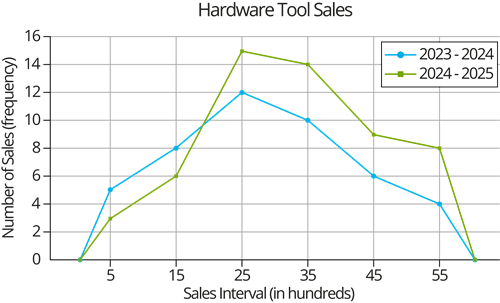
| Sales interval (in hundreds) | Financial year \(2023 - 2024\) | Financial year \(2024 - 2025\) |
| \(0-10\) | \(5\) | \(3\) |
| \(10-20\) | \(8\) | \(6\) |
| \(20-30\) | \(12\) | \(15\) |
| \(30-40\) | \(10\) | \(14\) |
| \(40-50\) | \(6\) | \(9\) |
| \(50-60\) | \(4\) | \(8\) |
To easily visualize this comparison, the data is represented using a frequency polygon, allowing easy examination of changes over the two years.
Based on the frequency polygon, answer the following questions.
1. In which sales interval did the company experience highest sale in both the financial years?
2. What is the difference in sales between the two financial years in the interval \(40-50\)?
3. What is the total sales frequency for the financial year \(2024 - 2025\)?
4.Why is a frequency polygon more effective than the table in this case study?